


SkyRecipes
IoT, Cooking, and Grocery Store in One Application
1
Goal Definition
The business owner, who was fully aligned with our business goals, had a clear vision and numerous ideas for taking Sky Recipes to new levels of service excellence in Russia. Strongly influenced by the Chinese approach to design, the owner believed that we should create a Super App. This would integrate a wide range of features and services into the existing mobile app, which was used to control smart devices like lamps, kettles, and scales.
Goal from Business
The most complete collection of recipes
Goal from Business
Fresh and eye catching interface
Goal from Business
A service that will work as a separate application and as a part of device‘s control panel
Goal from Business
Playground for authors
Goal from Business
Sell grocery directly from a recipe
Goal from Business
Flexible recipe collections for each user - consider his activity
Goal from Business
Social component
Goal from Dev Team
Create a universal module embedded in interfaces of different devices
Goal from Dev Team
Implement smart and plain recipes
Goal from Dev Team
Create a Design System
Goal from Dev Team
Optimised solution
2
Solution
The SkyRecipes project involved a complete redesign, transforming the app into a comprehensive tool for cooking, grocery shopping, and smart device integration. The UI was enhanced with a modern, user-friendly design that prioritized usability and accessibility. Key features such as timers, user collections, and a marketplace for kitchen devices were added, along with interactive social elements like ratings and comments. By aligning the app with user needs and smart technology, the solution streamlined meal preparation while offering a cohesive, engaging user experience across devices.
-
[1/8] Large collection of Recipes
We started with a modest cookbook focused solely on multicooker recipes. Thanks to the impressive efforts of our content team, we’ve expanded our collection to over 10,000 new recipes. This significant increase necessitated a more user-friendly interface. As a result, our new cookbook is now well-organized and far more useful for a wide range of culinary adventures.

-
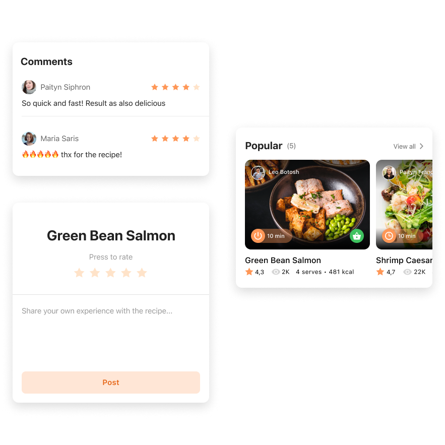
[2/8] Social Component
With the goal of building a community centered around smart devices, lifestyle, and health, we introduced several key features. As a first step, we added a recipe rating system, allowing users to rate recipes with a 5-star scale and leave comments. This encourages interaction and feedback, fostering a sense of community and engagement among users.
-
[3/8] Authors and Subscriptions
This module is not only a crucial part of our community-building efforts but also plays a significant role in boosting user engagement. By allowing users to follow their favorite authors and subscribe to their content, we create a more personalized and interactive experience, encouraging users to stay connected and engaged.

-
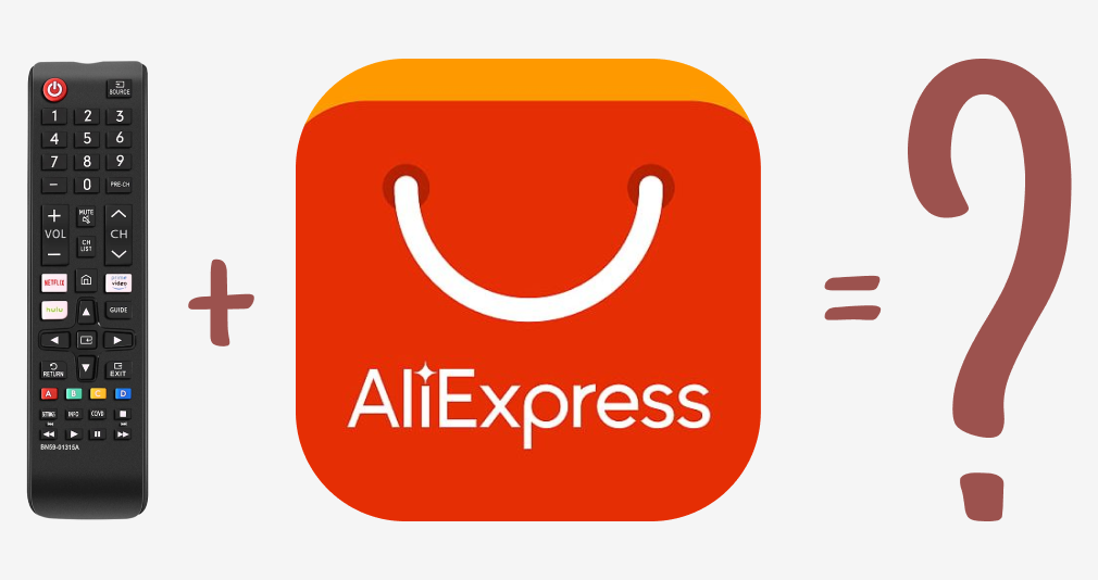
[4/8] Grocery Store
To create a seamless experience, we integrated the Sky Recipe cooking service with the SkyMarket shopping service. For our MVP solution, we introduced a "shopping list" feature tailored specifically for cooking needs. This clean, simple, and easily editable list focuses on presenting only the ingredients required for selected recipes, ensuring users can efficiently gather everything they need for their culinary creations.

-
[5/8] Recipes for Smart Devices
The smart recipe collection, which expertly syncs instructions with smart device hardware, was already a standout tool, tested by professional chefs in our lab. My role was to refresh this innovative cookbook with a striking visual update and enhance its functionality. The redesigned UX addresses previous navigation issues and introduces new features, offering a more intuitive and enjoyable user experience.

-
[6/8] Recipes without Smart Devices
To enhance interactivity and provide additional value to users, we added a timer function t a plain recipe. If a recipe doesn't have a specific program for a smart device, users can still manage their cooking process effectively by using the integrated timer. This feature ensures that even without smart capabilities, users can cook with precision and ease.

-
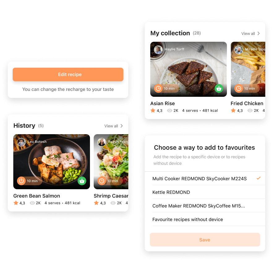
[7/8] User recipe collection
To help users manage their recipes, we included several key features. The "My Collection" feature allows users to save recipes and assign them to a device. The "History" feature keeps track of users' cooking experiences. Lastly, the "Recipe Editor" enables users to make their own improvements to any recipe.
-
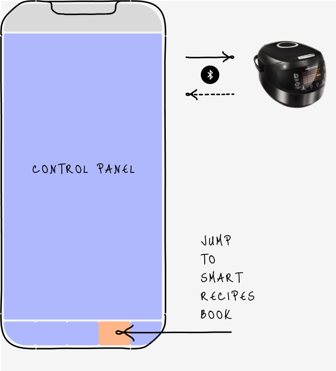
[8/8] Separate Cooking Service and Cooking Module Inside a Device
To make our digital cookbook even more useful, we integrated Sky Recipes directly into kitchen devices, whether they are smart or traditional. This means users can access Sky Recipes directly from the control panel of their cooking devices, seamlessly connecting their culinary activities with our extensive recipe collection.

3
Challenges
The process was a dynamic journey with its share of surprises and new discoveries. It had its moments of excitement and challenges, testing our perseverance along the way. Despite a few setbacks, the experience was ultimately rewarding and left us with a strong sense of achievement.
[UX]
-
[UX] -
[UX-1]
An Infinite Experience for Smart Kitchen
SITUATION
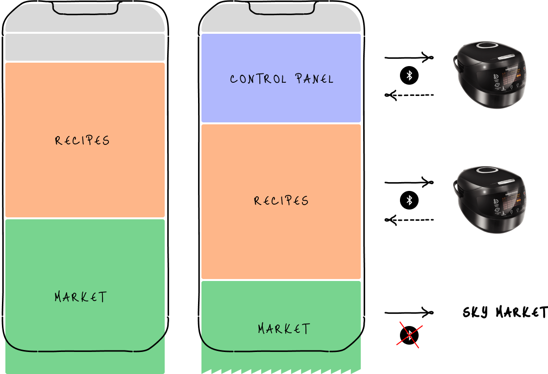
Under the "Asian way" approach, our business owner decided to transform our app's focus from a “control panel” to a “marketplace.” The new goals were to promote new services through infinite content scrolling and maximize the number of promotions.
TASK
My task was to conceptualize the main screens for smart kitchen devices and the Sky Recipe service. The challenge was to blend the functional interface (device control) with the service interface (recipes, marketplace) seamlessly.
ACTIONS
The main challenge was to balance the efficiency of a control panel with the engaging nature of a marketplace. Control panels aim to complete tasks quickly, while marketplaces aim to keep users browsing longer.
I started by designing a basic layout for smart devices and Sky Recipes, including three sections: control panel, Sky Recipes, and Sky Market. The control panel focused on functionality, while the other two encouraged user engagement through infinite scrolling.
Before
Smart Device / Main Screen
After
Sky Recipe as a standalone service and as a part of smart device
To achieve the infinite scrolling effect, I designed collections of recipes and products. Each collection was intended to entice users to explore further. I developed a collection component with filter logic, allowing us to control its functionality by adjusting the filter parameters.
Collection Concept

Collections for Sky Recipes and Sky Market services

RESULT
The new concept successfully bridged functionality and browsing. The ordering logic allowed users to complete tasks efficiently, while carefully chosen collections of products and recipes encouraged them to explore, experiment, and use our services. The most significant outcome was introducing new features, like the history collection, which enhanced productivity while promoting Sky Recipes.
The final design achieved a balance between functionality and engagement, transforming our app into a dynamic marketplace that meets both user needs and business goals.
[UX-2]
UX Optimisation: Navigation
SITUATION
TASK
ACTIONS
RESULT
I’m still working on the story.
Get in touch if you’d like more details!
[UX-3]
Quantitative research at pop-up stores
SITUATION
TASK
ACTIONS
RESULT
I’m still working on the story.
Get in touch if you’d like more details!
[UX-4]
Hypothesis Validation - Qualitative research
SITUATION
After completing the initial concept for our recipe app, we noticed some unusual interface behaviors that raised concerns. To address this, we decided to validate the interface through user research. I was responsible for organizing and conducting a quantitative user research study to gather actionable insights.
TASK
My task was to structure the research process and ensure it effectively highlighted usability issues. The goal was to validate the interface and determine how different user groups interacted with the app.
ACTIONS
Building on insights from previous research, I identified two key user groups:
Young women with small children, focused on optimizing their cooking time and prioritizing healthy food.
Young single men who wanted to cook at home but lacked the necessary skills.
I then developed testing scenarios and established success criteria. With a clear plan and trained interviewers, I conducted 12 user interviews to test two variations of the interface. Each participant followed the scenarios designed for their respective user group, allowing us to see how they navigated the app in real-world conditions.
After completing the interviews, I analyzed the data and compiled a report. The issues were categorized into four levels based on the severity of the problems users experienced. This allowed us to prioritize the most critical fixes and identify areas needing refinement.

Step 1.
Scenario
I created defined tasks and measurable metrics to validate our hypotheses. Some tasks focused on exploring users’ personal feelings and reactions to the interface, while others required objective measures of success, such as task completion time or error rates. This combination allowed us to capture both subjective and objective feedback during testing.

Step 2.
Prototype
Using Figma, I built an interactive prototype that simulated the core functions of the interface. Since we didn't need to test any user data input, the prototype was streamlined and fully interactive, allowing users to engage with it as they would in a real environment. This setup ensured that the testing focused solely on navigation and usability.

Step 3.
Interview
AlI conducted 12 interviews with users, all of which were recorded and later uploaded to our private YouTube channel. This allowed for seamless collaboration and detailed post-interview analysis by the entire team. Having the recordings also ensured that we could revisit specific moments to capture nuances in user feedback.

Step 4.
Insights
I compiled all results and insights into a detailed table, which included both quantitative metrics and qualitative feedback on users' feelings. The table helped us track performance across different tasks, and I added time codes from the video interviews, making it easy to refer back to specific moments when a problem occurred or a key insight was shared.

Step 5.
Report
Using the data from the insights table, I created a comprehensive report summarizing all user issues, frustrations, and blockers encountered during the tests. The report categorized problems based on their severity, helping us prioritize which aspects of the interface needed immediate attention and further refinement.
RESULT
The research provided us with valuable insights that significantly impacted our design decisions. It enabled us to:
Prioritize features based on user needs and usability challenges.
Refine the interface, addressing the most critical issues first.
Boost the team’s confidence in the direction of the product.
This validation process ensured that we were addressing real user needs and gave the team a solid foundation for moving forward with the project.
[Collaboration]
-
[Collaboration] -
[CO-1]
Streamlining a clear and trustworthy Business-Design collaboration
SITUATION
I faced a significant challenge when working with a business owner who was deeply passionate about creating an immersive Asian experience through a super app. The catch? The business owner had never worked entirely remotely before, and our team had limited experience with remote communication. It was crucial for me to establish a trustful process and ensure clear understanding and effective progress monitoring.
TASK
My primary responsibility was to manage this collaboration effectively. This included organizing weekly demos to cover idea generation and review modifications. Additionally, I needed to streamline the ideation process and maintain clear documentation to track progress.
To tackle these challenges, I implemented a structured approach:
Weekly Demos: I ensured that demos were held every week, showcasing the process of idea generation and reviewing modifications. This routine helped build trust and kept everyone aligned.
Ideation via Email: I managed the ideation process through email, allowing businesses to share their requirements. This provided me with ample time to validate these requirements with our development and UX design teams.
Documentation: We adopted a before-and-after style of documentation to clearly track our status and progress throughout the project. This method proved invaluable in maintaining transparency, allowing us to document every change and ensure that all team members stayed informed. By having a clear record of updates, we were able to keep everyone aligned and up to date on each development phase.
Summary: To handle the feedback effectively, I introduced the Watermelon method. This color-coded approach—where green signifies defined elements and red highlights areas needing improvement—was developed to manage the overwhelming volume of post-demo feedback. By applying color directly to the design, I made it easier for everyone to quickly identify approved parts and areas needing modification. Our tech lead even added a touch of humor by naming the method, which helped lighten the process and improve engagement.
ACTIONS


RESULT
The structured approach and the Watermelon method significantly improved our workflow. Weekly demos ensured consistent progress, while the ideation and documentation processes facilitated clear communication. The Watermelon method, in particular, streamlined feedback, making it easier to pinpoint and address areas for improvement. This collaborative effort led to a more cohesive understanding among team members and a more refined final product, fostering trust and a smooth remote working relationship.
The End
Contact me
Design Team
Product Owner,
Dev Team
Customers
Team
UX/UI Lead Designer
My Role